The Best Website for making Beginners from no knowledge to Professional
Creating a good-looking and functional login screen is one of the first things you’ll need when building an Android app. In this tutorial, I’ll walk you through How to Create a login UI step by step, explaining each component along the way.
Introduction: What Is a Login Screen?
A login screen is one of the most common user interface (UI) components in any mobile app. It is the first screen users see when they open an app that requires authentication. It allows users to securely enter their credentials like email and password to access their personal data or features in the app.
Why Is a Login Screen Important in Android Development?
A login screen helps:
- Protect sensitive user information
- Personalize the user experience
- Track user activity (e.g., in apps like Facebook or Gmail)
- Restrict certain app features to logged-in users only
- Track user roles (Admin or Users)
When Should You Use a Login Screen?
You should include a login screen in your Android app if:
- The app stores user-specific data (e.g., chats, purchases, personal content, balance, etc)
- You want to track user behavior across devices
- You want to offer personalized settings or dashboards
- You need users to perform actions like payments, uploads, or messaging
Now, let’s build a beautiful and simple login screen using XML layout in Android Studio.
How to Create a Login UI for Android App
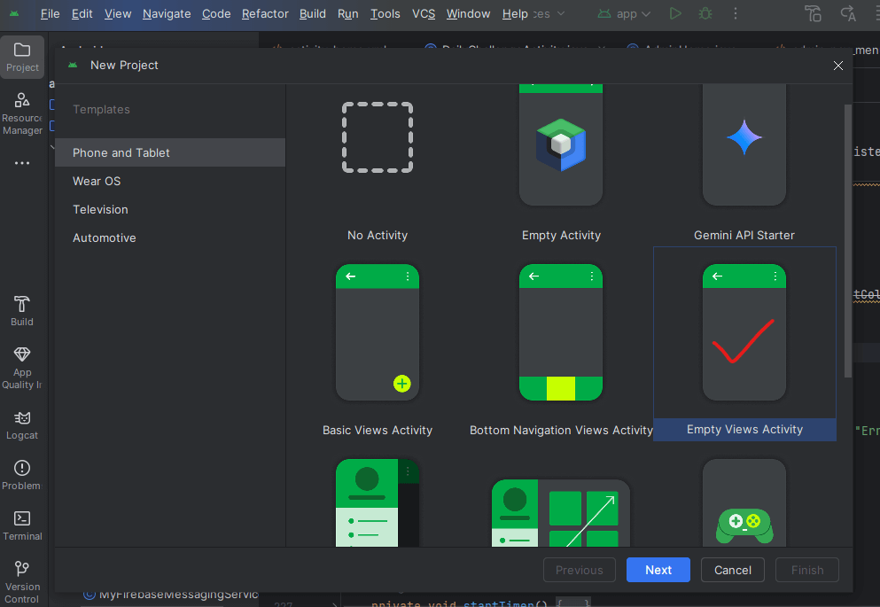
Let’s begin By Starting the Android Studio IDE (Integrated development environment) and selecting an “Empty Views Activity” as shown Below

Prerequisites
Before we begin, make sure you have:
- Android Studio installed
- Basic understanding of XML (we’ll explain as we go)
- A new Android project created
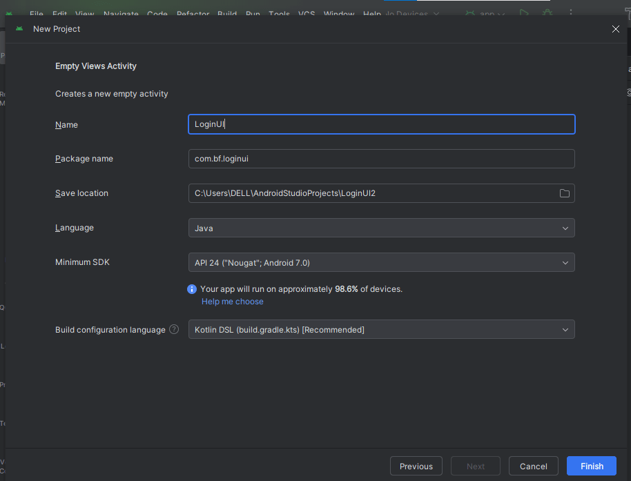
In the next Interface as shown below, set the name for your new project.

Click on the finish button and allow the app download necessary dependency and gradle files which are necessary for the app to run smoothly. Make sure your internet connection is turn and your computer connected else it won’t download.
After all gradle and dependency files is completely downloaded, set up the colors that will be used for the app design and shown below.
Part 1: Setting Up the Colors (colors.xml)
This file defines all the color values that your app will use. It’s good practice to define colors here so you can reuse them easily and change them globally.
Navigate to app > res > values >colors.xml – see attached image below:

Step 1: Set Up Your Colors
First, let’s define our color palette in res/values/colors.xml:
<?xml version="1.0" encoding="utf-8"?>
<resources>
    <color name="black">#FF000000</color>
    <color name="white">#FFFFFFFF</color>
    <color name="app_color">#1100FD</color>
    <color name="app_icon">#2c2c2c</color>
    <color name="hint_color">#949494</color>
    <color name="orange">#E94410</color>
    <color name="deep_orange">#902706</color>
    <color name="deep_blue">#05053E</color>
</resources>
What this does:
- Defines color resources we can reference throughout our app
- Uses hexadecimal color codes (like #FF000000 for black)
- Makes it easy to change colors globally by just editing this file
Step 2: Creating a Reusable Input Field Background (Drawable XML)
We’ll create a custom shape for our input fields in res/drawable/input_area.xml:
To create this file, right-click on the “drawable” folder, select “New” then “Drawable Resource File”. Set the following properties in the next opened window
- File name: input_area.xml
- Root element: shape
Leave other section as they are and click on “Ok”
This file styles your EditText fields by giving them rounded corners and a border. input_area.xml (Save inside res/drawable/). Copy/Paste the code below into the “input_area.xml” file.
<shape xmlns:android="http://schemas.android.com/apk/res/android">
    <stroke android:color="@color/hint_color" android:width="2dp"/>
    <corners
        android:topRightRadius="20dp"
        android:bottomLeftRadius="20dp"
        android:topLeftRadius="20dp"
        android:bottomRightRadius="20dp"/>
</shape>
What this does:
- Creates a rounded rectangle shape with 20dp corner radius
- Adds a 2dp border using our hint_color (#949494)
- Will be used as background for our text input fields
Step 3: Design the Login UI Layout
This is where you build your full login screen layout using components like EditText, Button, CheckBox, and ImageView.
Now let’s edit the xml file we will use for our login layout in the location: app > res > layout > activity_main.xml. For this purpose alone we maintain the “activity_main.xml” for our login layout but in the future when we will be creating a fully working Login Screen, we will use the appropriate activity (activity_login.xml).
Design – How to Create a Login UI for Android in Android Studio
copy the code below or download the attachment below and extract the necessary files to modify your existing code.
<?xml version="1.0" encoding="utf-8"?>
<LinearLayout
    xmlns:android="http://schemas.android.com/apk/res/android"
    xmlns:app="http://schemas.android.com/apk/res-auto"
    xmlns:tools="http://schemas.android.com/tools"
    android:id="@+id/main"
    android:layout_width="match_parent"
    android:layout_height="match_parent"
    android:gravity="center"
    android:padding="24dp"
    android:background="@color/white"
    android:orientation="vertical"
    tools:context=".LoginActivity">

    <!-- App logo -->
    <ImageView
        android:layout_width="154dp"
        android:layout_height="73dp"
        android:layout_gravity="center"
        android:layout_marginBottom="60dp"
        android:src="@drawable/ic_lock"
        app:tint="@color/orange" />

    <!-- Email Field -->
    <EditText
        android:layout_width="match_parent"
        android:layout_height="wrap_content"
        android:minHeight="55dp"
        android:hint="Email"
        android:textColorHint="@color/hint_color"
        android:paddingStart="15dp"
        android:textColor="@color/hint_color"
        android:layout_marginBottom="20dp"
        android:background="@drawable/input_area"
        android:layout_marginTop="20dp"/>

    <!-- Password Field -->
    <com.google.android.material.textfield.TextInputLayout
        android:layout_width="match_parent"
        android:layout_height="wrap_content"
        android:background="@drawable/input_area"
        app:hintEnabled="false"
        app:passwordToggleEnabled="true">
        <com.google.android.material.textfield.TextInputEditText
            android:layout_width="match_parent"
            android:layout_height="wrap_content"
            android:hint="Password"
            android:paddingStart="15dp"
            android:textColor="@color/hint_color"/>
    </com.google.android.material.textfield.TextInputLayout>

    <!-- Remember me and Forget Password -->
    <LinearLayout
        android:layout_width="match_parent"
        android:layout_height="48dp"
        android:gravity="center_horizontal"
        android:layout_marginTop="30dp"
        android:paddingTop="10dp"
        android:orientation="horizontal">
        <CheckBox
            android:layout_width="0dp"
            android:layout_weight="1"
            android:layout_height="wrap_content"
            android:textSize="16sp"
            android:text="Remember me"
            android:gravity="start"
            android:paddingVertical="5dp"
            android:textColor="@color/app_icon"
            android:buttonTint="@color/orange"/>
        <TextView
            android:layout_width="0dp"
            android:layout_height="wrap_content"
            android:layout_weight="1"
            android:text="Forget password"
            android:textColor="@color/black"/>
    </LinearLayout>

    <!-- Login Button -->
    <Button
        android:layout_width="match_parent"
        android:layout_height="wrap_content"
        android:minHeight="55dp"
        android:text="Login"
        android:backgroundTint="@color/orange"
        android:textColor="@color/white"
        android:textSize="17sp"
        android:layout_marginBottom="25dp"
        android:layout_marginTop="20dp"/>

    <!-- Signup Link -->
    <TextView
        android:layout_width="wrap_content"
        android:layout_height="wrap_content"
        android:text="Don't have account? Signup"
        android:textColor="@color/black"
        android:textSize="16sp"/>
</LinearLayout>
Breaking Down the Login UI Components
1. Root Layout (LinearLayout)
orientation="vertical": Stacks children verticallypadding="24dp": Adds space around all edgesbackground="@color/white": Sets white backgroundgravity="center": Centers children horizontally
2. App Logo (ImageView)
- Fixed width/height (154x73dp)
- Bottom margin of 60dp for spacing
- Uses an icon (ic_lock) tinted orange
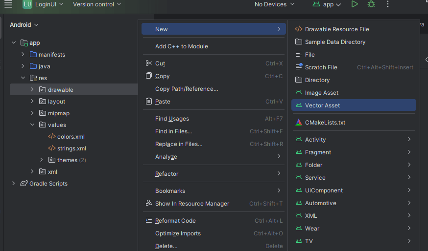
To create the images(Vector assets) we used in our design, right-click on the drawable folder, select “New” from the available options. See the Video in this article for more explanation if the image below is not fully clear.

READ ALSO: HOW TO CREATE A SIGNUP UI FOR ANDROID APP
3. Email Field (EditText)
- Uses our custom
input_areadrawable as background - Has hint text “Email” in hint_color
- Minimum height of 55dp for touchability
- 15dp start padding so text isn’t against the edge
4. Password Field (TextInputLayout with TextInputEditText)
- Material Design component with password toggle (TextInputLayout)
passwordToggleEnabled="true"shows eye icon to toggle visibility- Same styling as email field for consistency
5. Remember Me & Forgot Password (LinearLayout with CheckBox and TextView)
- Horizontal layout split 50/50 using weights
- Orange tinted checkbox for “Remember me”
- Simple text for “Forgot password”
6. Login Button (Button)
- Orange background with white text
- 55dp minimum height for easy tapping
- Top and bottom margins for spacing
7. Signup Link (TextView)
- Simple text prompting new users to sign up
- Could be made clickable later
Important Notes
- Material Components: We’re using Material Design components (
TextInputLayout,TextInputEditText) which require this dependency in yourbuild.gradle:
implementation 'com.google.android.material:material:1.5.0'- Image Resources: You’ll need to add the
ic_lockimage to yourres/drawablefolder or replace it with your own app logo file which can be copied and pasted in the drawable directory. - Responsiveness: The layout uses
dp(density-independent pixels) for sizing, which helps it look consistent across different screen sizes. - Accessibility: The large tap targets (55dp buttons/inputs) help with usability.
Login UI – Glossary
| Term | Meaning |
|---|---|
| XML | A markup language used to design UI layout in Android |
| LinearLayout | A view group that arranges its children in a single column or row |
| EditText | A field where users can enter text |
| TextInputLayout | A wrapper for EditText that adds features like password toggle |
| Drawable | XML file that defines shape, color, border for views |
| CheckBox | A box the user can check/uncheck |
| Button | A clickable UI element to perform an action |
| ImageView | A view used to display images |
| @color/ | Refers to a color defined in the colors.xml file |
| @drawable/ | Refers to a drawable resource like shapes or images |
Final Thoughts
This login UI features:
- Clean, modern design with rounded inputs
- Consistent color scheme
- Good spacing and sizing
- Material Design best practices
- All the essential login components
This tutorial should give you a solid foundation for creating login screens in Android. Happy coding!


